Foundation to WorkMax: Timesheet Redesign Targets a 100% Increase in Migration Conversions

+100%
Conversion Rate Increase
Product Management projected a +100% increase to our current conversion rate, selling WorkMax to Foundation Mobile users.
50%
Retention Rate Increase
Product Management projected a 50% increase in retention rate for our users who have already transitioned to WorkMax from Foundation Mobile.
2-3
Unit Sales per Month
Product Management projected an increase in WorkMax sales per month of 2 to 3 units.
1. Context
Sunsetting Foundation Mobile risked potential retention issues
Product management projected that adding WorkMax timesheet functionality could increase Foundation Mobile conversions by 100%+, boost retention by 50% for FSL accounting users, improve non-mobile conversions by 25 percentage points, and generate 2-3 additional sales units monthly for non-FSL accounting segments.
Existing users refused to migrate to WorkMax without equivalent timesheet functionality, threatening customer retention and revenue growth. My mission then became to identify workflows and translate them into the WorkMax environment, while of course making it even better than what they were already used to.
2. Research & Discovery
Insights from our trainers revealed workflow preferences missing from WorkMax
I collaborated with our trainers who interact with customers everyday to define key workflows missing, that drove resistance to the migration.
Users communicated to us that they were used to quickly adding multiple rows for employees and adding multiple variables like equipment, shift types (day, evening, night) and trades (carpenter, laborer, plumber) to accurately document operating costs.
Sessions with our trainers proved invaluable and helped us correctly prioritize nuances in data that was unique to WorkMax.

3. Problem Definition
Migration required familiar workflows with improved efficiency
The challenge wasn't simple feature parity - users needed WorkMax to match data entry workflows while of course taking the opportunity to make improvements.
Three critical workflow gaps blocked successful migration.
- Users needed to see more employees without excessive scrolling; on a standard desktop monitor Foundation capped at around 5 rows without additional variables
- Hour entries required customization for pay types, trade types and equipment; Foundation handled this by adding an entirely new row, all for 2 or 3 fields, we could do better and be more efficient with real estate
- Information hierarchy needed to support quick data review and entry, of tens of employees across multiple job types
Without addressing these workflows and features, users viewed WorkMax as inferior to their current tool and would never migrate, risking huge financial gains through an upsell to WorkMax.
4. solution strategy
I prioritized three workflow improvements through stakeholder collaboration
Working sessions with product managers and trainers identified the minimum viable improvements that would make it virtually a no-brainer to migrate to WorkMax.
My approach focused on:
- Condensing employee rows to maximize screen real estate
- Enhanced attribute fields for flexible hour tracking
- Improved information architecture based on validated scanning patterns.
This targeted approach ensured development resources addressed migration-critical features rather than secondary additions.


6. Validation & Testing
Stakeholder sessions confirmed design direction and feature priorities
Working sessions with trainers, stakeholders and product managers who understood our unique user workflows confirmed that our design direction would meet the criteria Foundation users needed.
They agreed that the streamlined displays were just what Foundation users needed, and that our enhancements were a welcome addition to what they already had with Foundation Mobile.
7. impact & Reflection
Learning from V1's collaborative approach led to a strategic pivot that produced the winning V2 redesign
The initial V1 timesheet was developed collaboratively with team members, but negative user feedback revealed it didn't address their needs.
Taking ownership of the V2 redesign, I focused on strategic decisions on the design that addressed the problems we heard, and really leaned into our subject matter experts.
What I'd do differently: Firstly, I would have spoken up about the problems I knew that V1 had in order to ship a better product the first time. Given more resources, I also would have loved to showcase a polished V2 to real Foundation clients.
A projected 100% conversion rate for Foundation clients is a huge win for the business, but also for UX in the company. It's more evident now that involving UX early, is a substantial benefit for business outcomes.


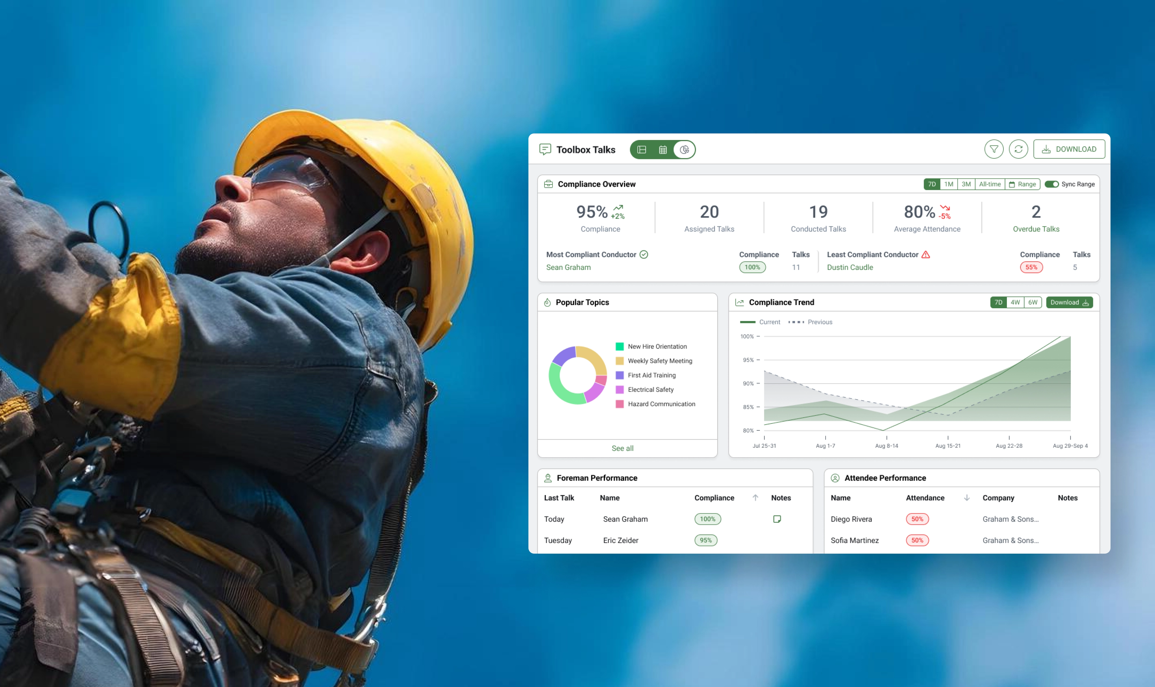
Reporting on Construction Safety Compliance with New Dashboards
Construction companies are expected to hold Toolbox Talks weekly or even daily to prevent safety incidents and injuries, so we built a robust reporting tool to identify compliance levels across organizations.
Foundation to WorkMax: Timesheet Redesign Targets a 100% Increase in Migration Conversions
With a projected 100% increase in conversion rate on the line, Foundation sought to transition its client base over to WorkMax, but clients needed a comprehensive timesheet feature.
+100%
Conversion Rate Increase
+50%
Retention Rate Increase
+2-3
Unit Sales per Month
Understanding Construction Safety Workflows Through SafetyHQ's Redesign
SafetyHQ needed to integrate with the HQ Suite family of products to retain its 93% retention rate, while eliminating performance risks that threatened customer satisfaction.
93%
Retention Rate
15%
Time-on-Task Reduction

Creating ProVia's Design Center for a B2B to Consumer Market Strategy
ProVia needed to revamp their marketing website, but they also wanted a creative way to showcase the array of product styles they offer.
