Creating ProVia's Design Center for a B2B to Consumer Market Strategy

1. Context
Shifting from B2B dealers to engaging homeowners directly
ProVia had a brand recognition problem. Homeowners knew the name but couldn't connect it to premium exterior products like doors, windows, and siding. The company's B2B marketing worked perfectly for dealers and contractors but left the homeowners purchasing the products almost completely in the dark about what ProVia actually made.
This was a massive missed opportunity in the $400+ billion home improvement market. Homeowners increasingly research products before talking to contractors, and ProVia risked losing market share to competitors who connected directly with homeowners during their research phase.
2. Research & Discovery
Uncovering homeowner decision-making patterns in the product
Customer service call logs revealed recurring homeowner confusion around product coordination. Common themes included questions about style compatibility and requests for visual examples of product combinations.
I had us install HotJar, and heat maps showed fragmented user behavior on product pages, with scattered clicking patterns indicating users struggled to find clear navigation paths through product categories.
Stakeholder interviews with customer service and sales teams confirmed homeowners frequently wondered how certain products worked with each other aesthetically - validating the need for style-first navigation and visual design tools.

3. Problem Definition
Homeowners needed guided discovery, not just specifications
The issue wasn't just brand awareness but product comprehension, and how ProVia would fit into a very important home-reno project. Homeowners couldn't visualize how individual ProVia products would work together to create their dream home aesthetic. If we could leverage this, the potential for upselling our products was huge.
Success with this new website meant educating homeowners on what was possible and improving dealer referral quality through better-educated prospects who arrived with clear preferences and visual inspiration.
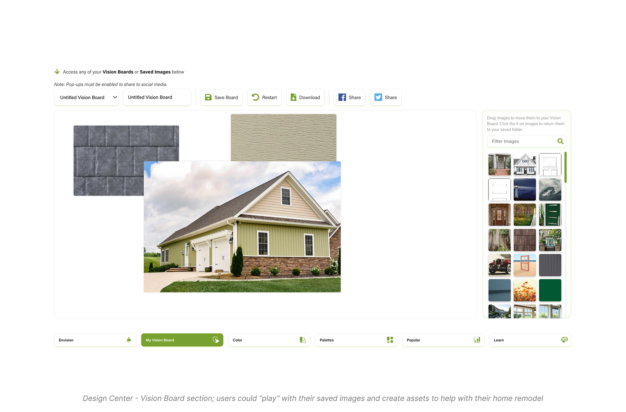
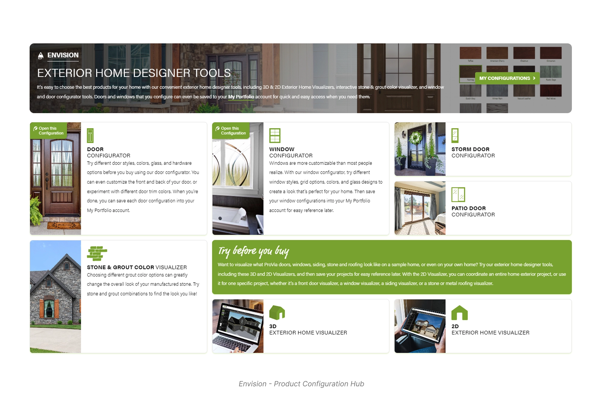
4. solution strategy
Creating guided product discovery through the Design Center
I proposed a self-service Design Center that would guide homeowners through product combinations while collecting preferences for dealer handoff. The dashboard approach borrowed from familiar financial interfaces, giving homeowners confidence in such a major investment.
Four core design principles emerged from our research insights.
- Homeowners think visually first, so we prioritized stylized galleries and website visuals over technical details
- Analytics on the original site showed scattered clicking patterns, leading to intentional information architecture, to properly organize the catalogue of products
- We made saving and favoriting the primary interaction to engage homeowners, using familiar patterns found on social media, especially Pinterest
- I modernized legacy tools like 2D product configurators, originally only for dealers, now available for homeowners to use in the Design Center
This strategy let ProVia engage homeowners directly while strengthening dealer relationships through qualified leads.


6. Validation & Testing
Measuring engagement and product fit with our CS reps
Before launch, we tested with ProVia employees for two weeks, particularly customer service teams who knew homeowners well. Feedback showed improved navigation speed and the modern style was welcomed by employees aware of how antiquated the old site had been.
I drafted a feedback survey with gift card incentives to assess product discovery, learning, and first-time Design Center usage. We discovered the Design Center worked better as separate modules rather than combined sections, leading us to restructure it into multiple focused pages.
After this change, HotJar recordings revealed users spending significantly more time in the Design Center with focused engagement rather than quickly moving between features. While external homeowner testing was limited by timeline, early internal testing suggested successful adoption.
7. impact & Reflection
Positioning ProVia for direct homeowner engagement
The Design Center established ProVia's first capability for direct-to-consumer marketing, while still maintaining dealer relationships. Users were more engaged as they browsed products, and dealers received better-qualified leads with visual inspiration and documented preferences.
The biggest learning was that homeowners needed dramatically more context than dealers or contractors, requiring different information architecture for the same products.
Looking back: This new site was a huge step forward for a legacy brand like ProVia. So much so that UX initiatives in the company increased, with more collaboration between Marketing and IT.
If I were to do this again, I would use a different platform than Elementor on WordPress. Elementor and the plugins we relied on for core functionality caused major performance issues, and the website eventually required a complete rebuild after I left.


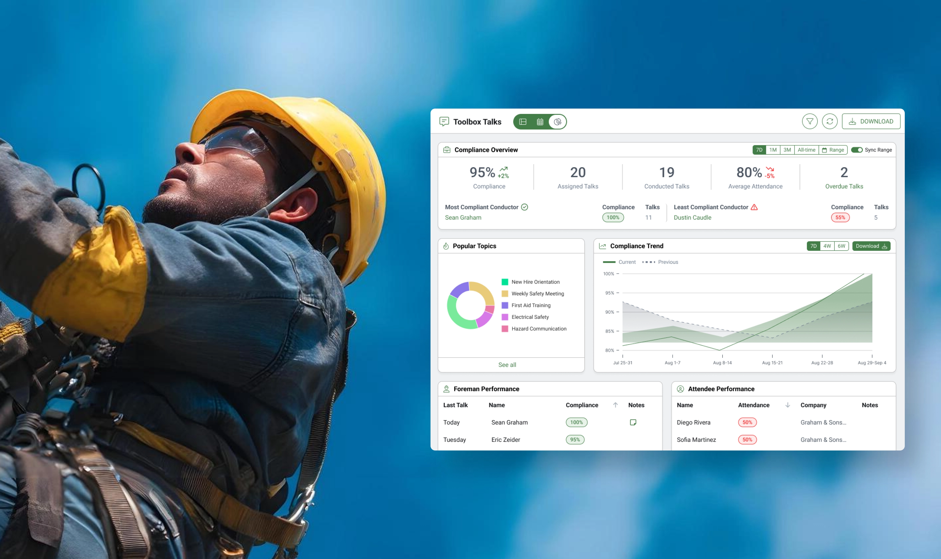
Reporting on Construction Safety Compliance with New Dashboards
Construction companies are expected to hold Toolbox Talks weekly or even daily to prevent safety incidents and injuries, so we built a robust reporting tool to identify compliance levels across organizations.
Foundation to WorkMax: Timesheet Redesign Targets a 100% Increase in Migration Conversions
With a projected 100% increase in conversion rate on the line, Foundation sought to transition its client base over to WorkMax, but clients needed a comprehensive timesheet feature.
+100%
Conversion Rate Increase
+50%
Retention Rate Increase
+2-3
Unit Sales per Month

Understanding Construction Safety Workflows Through SafetyHQ's Redesign
SafetyHQ needed to integrate with the HQ Suite family of products to retain its 93% retention rate, while eliminating performance risks that threatened customer satisfaction.
93%
Retention Rate
15%
Time-on-Task Reduction
