Understanding Construction Safety Workflows Through SafetyHQ's Redesign

93%
Retention Rate
SafetyHQ had a 93% retention rate, which is considered very good by SaaS standards, and was at risk of being affected by technical errors.
~15%
Time on Task Reduction
I redesigned critical workflows like form compilation & completion. and customer onboarding to cut down on clicks and time.
1. Context
SafetyHQ risked their 93% retention rate because of critical technical Wordpress errors
Despite maintaining strong client loyalty, the WordPress platform faced critical performance and security issues while remaining isolated from the HQ Suite brand family. As the sole designer, I led a complete platform rebuild over 6 months, upgrading desktop and mobile design patterns like form components, navigation and data migration.
Less-than reliable safety compliance tools directly impact worker safety and company liability, making reliable workflows essential for construction teams. Foundation built all the HQ Suite apps in Vue3, so the same was to be done for SafetyHQ.
2. Research & Discovery
Many foremen saw safety documentation as a "get it over with" task
I collaborated with trainers and stakeholders to list out the priorities foremen needed from our product, and the response was that they would rather "get it over with" and didn't care much for modern design patterns, leaving UI innovation up to me. I validated this "get it over with" insight by further interviews with stakeholders, sales reps and trainers.
Complex forms required 15+ minutes of compilation, even sometimes impacting other customers in the process. This critical technical error was a huge business risk, costing us face with customers and more money spent on temporary fixes.


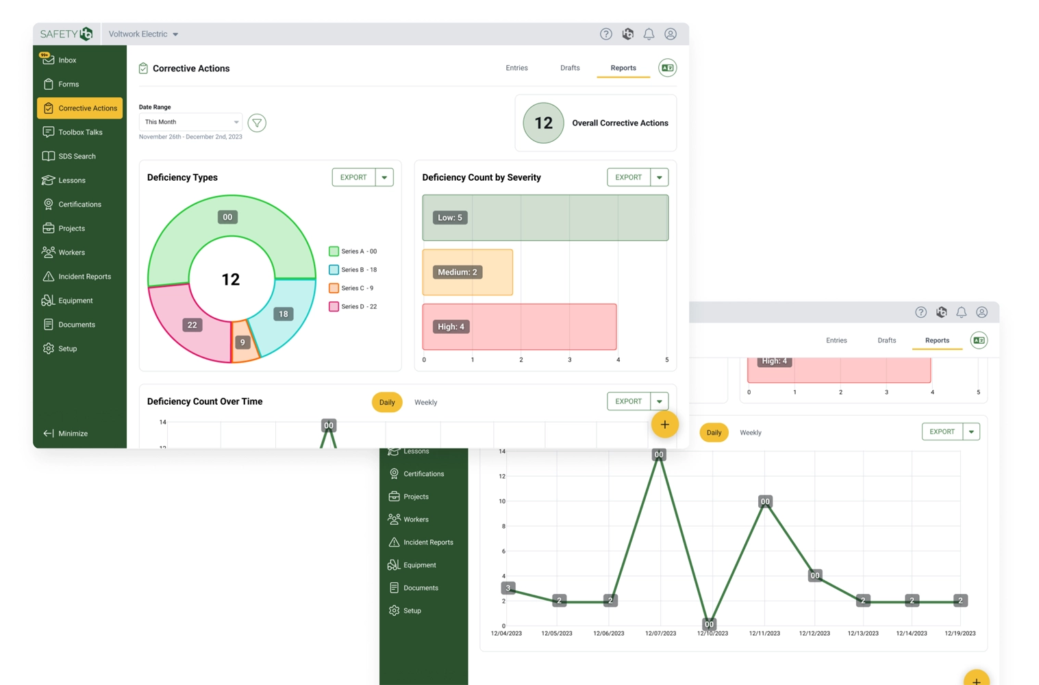
3. Problem Definition
Safety forms required too many clicks and created workflow barriers
Complex forms required 15+ minutes of compilation, frustrating time-pressed foremen with excessive clicks and visual clutter. The interface designed for them didn't match field worker needs who required quick, focused interactions.
My approach centered on simplifying navigation and prioritizing mobile-first design for key workflows like form compilation and completion, across both foremen, employee and internal customer service personas. Success criteria included reducing time-on-task by 15% while maintaining the established 93% retention rate.
4. solution strategy
Speed over sophistication became our guiding principle
Four core principles guided my design approach:
- Speed over sophistication for quick task completion
- Recognition over recall by making nav links more visible
- Mobile-first approach for field-based work
- Progressive disclosure showing only relevant information.
I separated navigation from action buttons to reduce confusion, leveraged the HQ Suite design system while adapting it for key mobile-first workflows, as we moved from WordPress to Vue3 for better performance and HQ Suite brand consistency.


6. Validation & Testing
Timeline constraints limited comprehensive user testing with actual foremen
Due to timeline constraints, I conducted internal testing throughout development with stakeholders and trainers to identify optimal workflows and UI patterns, namely on navigation and form components, the most critical touchpoints for our users. We also spent a lot of time making sure the internal implementation tools worked for our teams, focusing on the Migration and Setup modules.
The timeline for our initial design sprints was quite short, around 3 months out of the full 6 I spent designing and iterating, and we just couldn't afford to do user testing, so feedback from our most user-facing teams would have to suffice. Ideally, I would have done remote usability testing with construction teams and A/B tested navigation and form entry and compilation patterns, but Foundations timeline and resources didn't afford for that at all.
7. impact & Reflection
SafetyHQ successfully joined the HQ Suite family with measurable improvements
The redesign reduced clicks for form entry and compilation by roughly 15-20%, eliminated crashes, and improved load times. We maintained 93% retention during migration while integrating SafetyHQ into the HQ Suite brand.
Understanding the "get it over with" mentality proved crucial for design decisions. Looking back, I would have loved to conduct remote testing with real foremen to validate our new patterns, but settling for our trusted trainers and stakeholders input had to suffice.


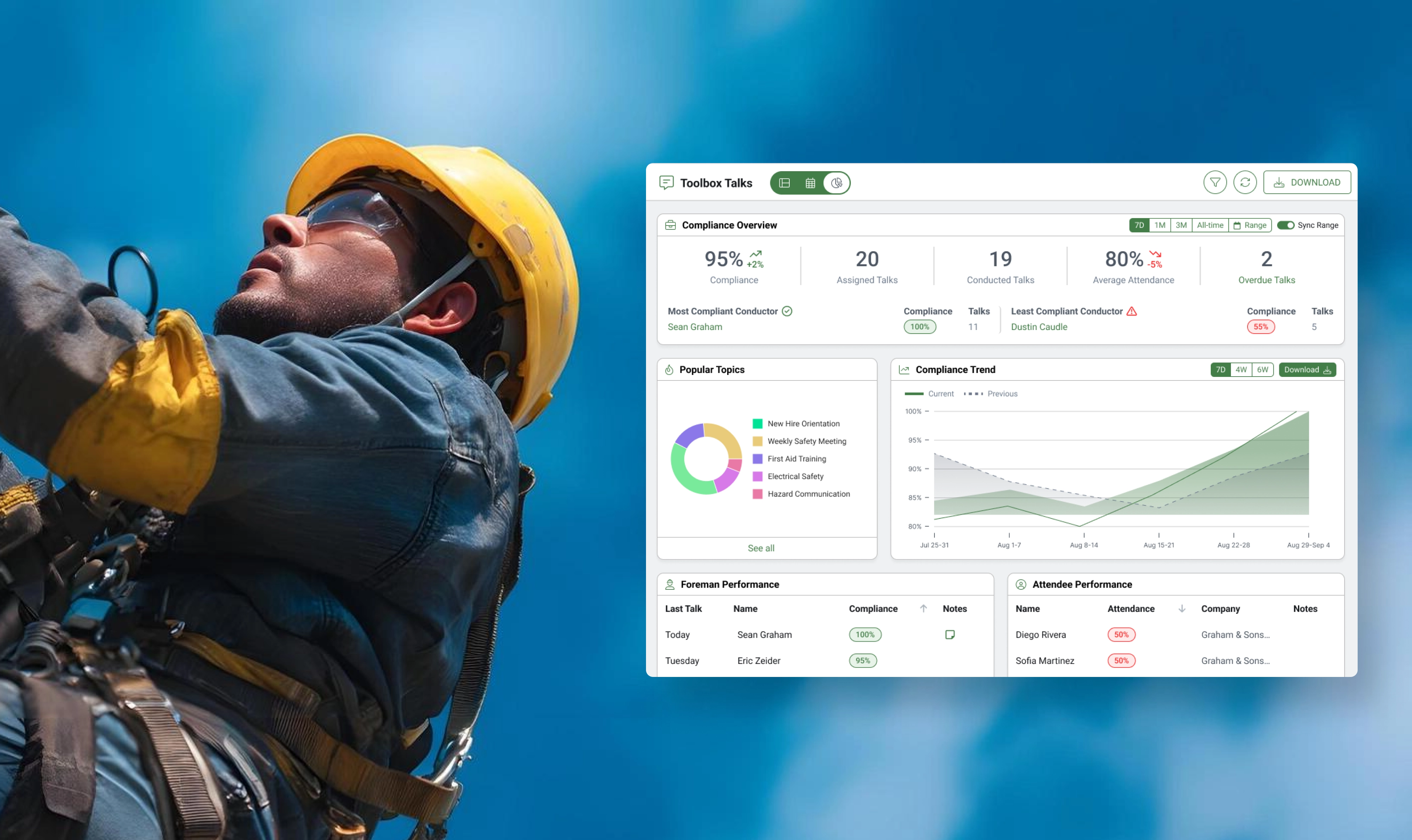
Reporting on Construction Safety Compliance with New Dashboards
Construction companies are expected to hold Toolbox Talks weekly or even daily to prevent safety incidents and injuries, so we built a robust reporting tool to identify compliance levels across organizations.
Foundation to WorkMax: Timesheet Redesign Targets a 100% Increase in Migration Conversions
With a projected 100% increase in conversion rate on the line, Foundation sought to transition its client base over to WorkMax, but clients needed a comprehensive timesheet feature.
+100%
Conversion Rate Increase
+50%
Retention Rate Increase
+2-3
Unit Sales per Month

Creating ProVia's Design Center for a B2B to Consumer Market Strategy
ProVia needed to revamp their marketing website, but they also wanted a creative way to showcase the array of product styles they offer.
